LOVE DRUG

Thursday 30 September 2010

Paranormal activity ...


The first shot is complete darkness which builds tension and gives away the fact that the film may be a horror/thriller. The audience becomes tense and worried about what is going to happen next. The next shot is a the same black screen but with the screen grey fuzzing coming across the screen which gives a shock and makes the audience feel uncertainty


The shot then goes black and the next thing that pops up on the screen is a man flying towards the screen which shocks the audience and then creates tension with in the audience who are watching it. The low key lighting hints that the genre of the film is a horror/thriller. The setting of the film shows that the bed which is shown it is set in a house which means the audience can relate to the film. Also the small clock on the bottom of the screen shows that the filming is that it is an early time in the morning which shows that something is not normal as most people would be sleeping.


After the man flashes up the screen goes back to the screen and flashes up three times which leads the audience anticipating something bad is going to happen and gets them tense. The low key lighting creates a sense of uncertainty, the canted angle makes it feel as if the camera is handheld and makes the audience feel as if they are living in the movie 


The next scene is into a room with a baby in a cot and a dog guarding the baby in the cot. With the audience knowing that there is a baby within the scene as we have a child centred society. The clock is still at the bottom of the screen and it shows the clock is at an earlier time which shows that the trailer is going in reverse which makes the audience wonder what is going on.


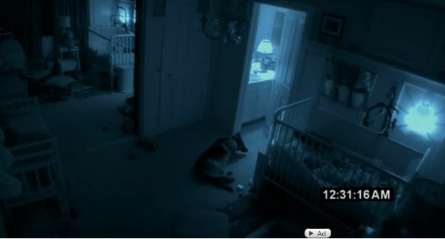
 The next screen shows up nothing can prepare you which makes the reader think what is going on and is something going to scare them after. 


The next shot is the same room as the baby in the cot before. There is a strange figure standing in the door which makes the audience worry about the baby in the cot as the dog has gone and the baby is alone so it strikes the aduience that something is going to happen.


The last shot is a name of the film which will make the audience remember the name as it is the last thing that sticks in there head.

Teaser trailer is a advertising campaign ...

An  advertising campaign is a series of advertisement messages that advertising a single product such as a film. Advertising campaigns appear in different media for a film advertisement they can come across in magazines and websites plus many more. The campaign themes are usually developed with the intention of building up hype before a films release so that the film has a wide audience when the film is released.

The advertising campaign normally consisted of
Stars interviews: This gets the actors op ion on the film so more people will want to watch the film
Teaser Trailers : Teaser trailers give people and incite into the film so they can see if they will like the film
Billboards : Billboards quickly capture the audience attention so that they subconsciously take in the picture and then they will remember it.
Websites : Websites give extra information about the film so if people want to find out extra information
Critical reviews : Critical Reviews if people can see reviews if the are good ones then more people will be willing to go and watch the film because they know that many people have liked it.

Sunday 26 September 2010

Similarities and Differences between full length trailers and teaser trailers

 Teaser trailers are normally between 30 to 90 seconds in length where as a film trailer can range from 2.30 to 4 minutes, they teaser trailer doesn't give much away and is can be released a long time before the film is released as it is created to promote the film. Where as a full length trailer gives more of the storyline and it realised a couple of weeks before the realised date so that the audience get more of an incite to the film.  In both full length and  teaser trailers there is normally a soundtrack running over the film which relates to the film and can create more tension or create sympathy with the actors. Both of the trailers have the same purpose which is to entice the audience to watch the film so that the production company can get money from the audience. A teaser trailer normally has quick edits as it builds tension about the film, a full length trailer has the chance to put a range of different edits. Both of the trailers features a voice over normally featuring the dialogue of "coming soon". Both the teaser trailer and full length trailer establishes the genre of the film which then also establishes the audience for the film. The main characters are identified in the trailers and some names are given as to incite the audience in to watch the film. Also they certification is given to shows who the film is suitable for. In full length trailers they often include any nominations that the film has recieved.

Friday 24 September 2010

Similarities of promotion of the notebook

 The Dvd case has a natural setting as if the couple are outside, and the rain shows a scene that will attract most females because it is something that they dream about.  Also the title is done is in a old fashion font, which could link back to the film saying that it is set in old fashion times. Also the way the actors are positioned shows that they have a strong relationship with each other. The actors names are on the top of the page which shows that they were well know actors so they are drawing the audience in.

A review qoute was put on the front cover of the Dvd which shows that the film is enjoyed by many critticts so the audience that it is aimed at will enjoy the film. 

The similarities between the Dvd and trailer is that the two main characters are the same and they are in a similar position showing the relationship between the characters. Also the dvd case is shown on the front cover which creates a strong brand identity. The difference on the website is that the plot is lined out which gives away some of the movie as the dvd case doesnt give anything away.

The trailer shows both the main characters in it so links to the website and the Dvd case also the title is the same as the Dvd case which links back to the setting of the film . The actors are also shown on the trailer which helps to draw the audience in.

Sex in the city website


Also i created a navigation map for the site so i can find out the typical conventions of a film website so i can create my website

The website starts with a homepage which has pictures of the site to welcome people in they then have the choice to go onto the site on the main home page image you can watch the trailer and go to the online shop.From the main page you can go onto all of the features such as cast and crew,Photos and videos and many more. The interesting thing that i have learnt from the website is that every page has links to all the other pages so the audience don't have to go back to the main page each time. I will take this idea and put it into my website design


Thursday 23 September 2010

First draft synopsis ....


Everything in Chloe’s life is perfect; she has the perfect best friend, the perfect boyfriend and the perfect grades. Life’s going exactly how she had always imagined it to. Now that everything’s falling to plan, and everybody including her is turning 18, Chloe can’t wait to live life to the full. However, things don’t quite go her way.

Slowly Chloe’s perfect world starts to crumble; maybe her best friend Fran and boyfriend Daniel aren’t so perfect after all. What used to be one hour phone calls every night between Fran and Chloe soon changed to 10 minute calls once a week. Why was she acting so weird? Did it have something to do with Daniel and why he’s pressuring her into their ‘first time’?

All Chloe has to do is find a solution to all of her problems, get things back on track so she can have her fairytale ending and be the perfect Chloe she once was. Will her best friend and boyfriend issues be fixed or will she find out that the truth is, those who she thought she couldn’t live without are in fact the ones she’s best off without.


This is our first draft of our synopsis, but after some deliberation we have decided that there is not enough distribution within our synopsis so we are going to conducted some target audience research to see what they would want.

Plot Summarys

The characters are falling in love, falling out of love, some are with right people, some are with the wrong people, some are looking to have an affair, some are in the period of mourning; a capsule summary of reality. Love begins and love ends. They flirt a lot. They are all flirting with love. At all ages and social levels, love is the theme. Romantic love and brotherly love is the hotchpotch through out the movie. Most of the movie is filmed in London, during Christmas and the characters all ended up at Heathrow airport a very uplifting note Written by Rosemea D.S.

This is a plot for a Rom- Com which has been a successful film, The film is based on a lot of different relationships which are all at different stages they all link in someway to each other. Having a lot of different relationships keeps the audience hooked on the film as they will want to know what is going to happen.


In the romantic drama Remember Me, Robert Pattinson plays Tyler, a rebellious young man in New York City who has a strained relationship with his father (Pierce Brosnan) ever since tragedy separated their family. Tyler didn't think anyone could possibly understand what he was going through until the day he met Ally (Emilie de Ravin) through an unusual twist of fate. Love was the last thing on his mind, but as her spirit unexpectedly heals and inspires him, he begins to fall for her. Through their love, he begins to find happiness and meaning in his life. Soon, hidden secrets are revealed, tragedy lingers in the air, as the circumstances that brought them together threaten to tear them apart. Set in the summer of 2001, Remember Me is a story about the power of love, the strength of family, and the importance of living passionately and treasuring every day of one's life.

With Remember me again the film is based on relationships which keeps the reader gripped on the film. With the strain on the relationship in the middle of the film makes the audience want the relationship to meant and for there to be a happy ending.


Milo Boyd, a down-on-his-luck bounty hunter, gets his dream job when he is assigned to track down his bail-jumping ex-wife, reporter Nicole Hurly. He thinks all that's ahead is an easy payday, but when Nicole gives him the slip so she can chase a lead on a murder cover-up, Milo realizes that nothing ever goes simply with him and Nicole. The exes continually one-up each other - until they find themselves on the run for their lives. They thought their promise to love, honor and obey was tough - staying alive is going to be a whole lot tougher. Written by Sony Pictures

This is based on one relationship that has many complications which makes the audience hooked, Also because the actors have a history the audience want them to get back with each other and will watch the movie because they want to see the ending.

Saturday 18 September 2010

Dear john

The home page is a pale blue colour which creates a calm mood and links in with the setting that is at the beach. The film is distributed by Sony which is a large company which enables the film to be accessed by a larger audience. You are able to watch the trailer of the home page but you can then enter the site which enables people to get more information from the site.  The icons at the bottom of the page such as the facebook item enables the audience to follow the film and the production of the film on facebook so they feel as more as a part of it. As this film has been released it has links that you are able to buy the DVD straight from the site. The gold writing from the dear can represent that this film is different and a winner.  The quotations on the home page gives the audience peoples opinion which may persuade the audience to watch the film.

The pictures give an incite into the film and enables us to see different settings, There are only two characters within the home page which gives the impression that they are the main characters and are the most important. The special features allows the audience to feel as if they are getting something extra. Also the small print at the bottom gives all the details about the film.


This is the main page it is taken from the film, it is the natural setting which shows that the film is about being natural and "falling in love" the body positioning in the shot shows that the actors are have a relationship because they are comfortable with each other. The music player along the bottom of the page plays the soundtracks which allows the audience to feel part of the film. The colour scheme is very similar to the first page so it creates a strong identity. The links to the other pages are in the bottom right hand corner which doesn't dare attention from the main picture. Also the genre from the film is shown here by the mise en scene of the picture with the male being protective over the female by having his body around the female. Also down the bottom of the page quotes  " what would you do with a letter that changed everything" which is from the film which makes people remember the film.


These page has the pale blue background which follows the conventions of the previous pages. these page has parts from the film that you can read from. It is done in the format of a letter which is part of  the film which will remind the audience of the film. A disadvantage of this website is that the link only takes you to the home page so to click onto the main page you have to go through the whole pages which takes allot of time and may annoy the audience. The bottom of the page looks like the journal that the characters keeps his letters in so it links back to the page. The bottom of the page has the release date which would have shown people when they could have watch the movie.


The last page isn't really relevant to the movie it doesn't follow any of the conventions of the website but it is a link to watch other trailers for similar movies.


This website doesn't have many pages to it and then is basic with the pages that it offers i think that the information on my website will have to have a lot more content and than this website and it should have more pages and all of the pages should link and look similar.

Fast romance

http://www.youtube.com/watch?v=ZdN183RFVFc

Conventions of a romance ...

*Starts with the production company
*Clip, texts, Clip, Text
* Follows Todorvos theory
* Something drastic happens within the disruption which breaks up the couple
* Normally a best friend/Family member who is part of the film
*Introduces the main characters
*Sets out the theme of the film
*Builds up suspense to see if the couple will end up  together
* Has a happy ending where the couple end up together

The teaser trailer ...

* Normally between 30 to 90 seconds
*Soundtrack running over the film
*Entice the audience to watch the film
*Doesn't give the plot away
*Quick edits normally straight cuts
* Features a voice over
* Establishes the genre of the film
*Identifies the main characters
*Personality of characters
*The date of release
* Often the format of Clip text clip text

Navigation .....

The homepage is the first page that you come to when you click on the website, off the home page on the left they are the things that you can access of the home page. The website has a very good layout as it is very simple and the order of the website is the order of the film so if have people have seen the film they will understand the website.  Each individual page has links of that page that people can get more information out of the pages. Also the pages that are coloured are pages that are the same but you can get to them through two different ways. Also through all the pages there are links back to the first page or to the main pages.

Friday 17 September 2010

Resident Evil Afterlife 3D

On the front cover the female is the only person showing that she is main character and is dominant. The shattering glass around the main character shows that she is faced with danger and links back into the genre . The props that she is holding would represent a thriller genre but then the colour scheme is mainly black which co notates mystery. The red writing and the boarder of the box as red co notates danger and can be linked to blood which would link in with the genre of horror which would suggest that the film is a horror/ thriller. The only name that appears on the page is the name of the females and normally there are many actors name on the website which could show that the female is the most famous actor in the film. The writing on the page is sharp it looks like a knife which could link in with the main title as it says about evil. Also they certificate that the film has been given which also helps with the target audience which i believe is young adults from 15 - 30. The sponsors of the film are along the bottom which creates a strong brand identity.
The homepage still carries on with the colour scheme so it creates a strong brand identity, by having the same girl as the first page it creates the thought that she is the main character and that people should pay attention to her as she is important by having her holding guns goes against the stereo typical conventions of a female by being he hero as the female in thrillers are normally the victims. The name is still the same as on the front page as it helps to create a strong identity. The links on the side look as if they are coming from the shattered pieces of glass which links into the genre but it could also be confusing for some people as it may just look like a picture. The certificate is on the page as to reiterate the page that the person must be to watch the film this shows that the scenes in the film may be either scary or unsuitable for some people. The sponsors are also along the bottom of the page to try get the audience to remember their logo.
This is one of the links off the main page, Assault on Umbrella follows the same layout through as the first two pages this enables people to know where to find links on the page as they are familiar with the layout. The colour scheme stays the same on this page which creates the brand identity. Also on this page there is still the theme of smashing glass but on this page there is gun shots as the bullet points which enable you to click on the different links on the left hand side. Also there is links along the bottom which take you to different pages for back to the home page. The female is dressed in a different outfit which is showing a different part of the movie which gets the viewer interested and if they have not watched the film it gets them interested in the film.The title of the page is in the same font as the title of the film which helps to make the brand of the film stick in the readers head. The sponsors are down the bottom of the page again so that the audience get used to seeing the logos so that they subconsciously have the brand in their mind. The certificate is also at the bottom which helps with the same layout.
This page is another link, Search for the survivors has the same layout as the other pages but the picture on this page looks quite calm which may link in with the title of the page as in the person in the boat is looking for survivors this could also show some of the story and that there is some hope within the film. Going against that is the bullet holes in the glass to show that there is still disruption within the film. The name of the film is still written in the same font which create a strong identity. On this slide it shows when the film is being released which allows people to pre book tickets and to build excitement for the film.


The overcome the infected page shows another scene from the film another action scene only the female is not the dominant character in this scene, she is following a male character which would go with the stereo typical representation of a female. The male normally leads the female as they are thought to be "stronger" and more capable to fight. The layout of the page is the same and the pages before which create brand identity the name of the film is in the same place as all the former pages which enables the audience to know exactly where everything on the page is. The sponsors is on the page to make sure they stick in the audiences head. The colour scheme is the same as the previous pages which creates the films identity.
The colour scheme on this page is completely different the page is covered in white which is the opposite which could represent a happy ending within the film or the fact that good overcomes evil. The female is closest to the audience this could show again that she is the main character and linking in with the colour that she is the hero that overcomes the evil. The man in the background looks powerful as he is a thrones and thrones and associated with power which could show that the person on the throne is the evil person along with the dog that is sat beside him shows that he need to be protected. The layout of the page is the same as the other pages this helps the audience as they are now familiar with the website.
The same layout through as the all the pages this enables people to know where to find links on the page as they are familiar with the layout. The colour scheme stays the same on this page which creates the brand identity. Also on this page there is still the theme of smashing glass but on this page there is gun shots as the bullet points which enable you to click on the different links on the left hand side. Also there is links along the bottom which take you to different pages for back to the home page. The female is dressed in a different outfit which is showing a different part of the movie which gets the viewer interested and if they have not watched the film it gets them interested in the film.The title of the page is in the same font as the title of the film which helps to make the brand of the film stick in the readers head. The sponsors are down the bottom of the page again so that the audience get used to seeing the logos so that they subconsciously have the brand in their mind. The certificate is also at the bottom which helps with the same layout. This page is the same as page two only the content is different.

Purpose and Conventions of film website .....

*Inform the audience about the film
*The website is very interactive which enables the audience to get involved with the movie
* Persuades the audience to watch the movie


* Home page
* Links to different areas of the site
*Colour scheme running throughout all of the pages
*Navagtion bar

Thursday 16 September 2010

Blogging!

As you may have noticed i have chosen blogging to complete my evaluation and to hold all of my work. A blog is type of website that is maintained by someone or a group of people, in this instance this blog will be maintained by me. People will be able to go onto my blog and read all the posts i write, they can also comment on my posts to give me feedback which i feel is important because it is hard to find the faults with a product you have created.
On a blog you can use loads of different ways to put information on you can use pictures and videos in your posts this is also a great advantage as it allows students to show their personality throughout their work.


I chose blogging also because it is an interesting way for people to follow what i am doing, i feel that i can also reflect my personality through my blog and people will be able to feel as if they know me as a person. It gives me the chance to be creative with all the different ways that you can display information. I have also thought of some negative thoughts about blogging not everyone will be able to access the blog easily as some people don't have internet access. I have evaluated the positive and negative points of blogging and i feel that the positive over ride the negatives.

First post :D

Hello again, it feels weird to be starting A2 media last year went so quickly! This year i am studying Media,Travel and Tourism and Business at A2. I go to sponne school and i am looking forward to getting on with my A2 coursework as i feel the coursework will challenge me.

My As media exam i felt went quite well, i was very happy with the textual analysis question. All of the revision on the music industry that i has undertaken helped me alot as i was able to put most of it into my question. I was happy with my result and felt that i a performed to the best of my ability.